FAN FLYER
a one-stop platform offering exclusive travel packages to football games, including flights, accommodations, and match tickets.
a one-stop platform offering exclusive travel packages to football games, including flights, accommodations, and match tickets.
As the sole designer on this project, I was tasked with creating a new flow on an existing platform, focused on customization of travel packages for football fans which include match tickets, flight tickets and accommodation.
The main phases of my work included: Understanding Business & Technical Constraints, Mapping User Flows, Wireframing, UI Design, Testing & Iteration with Stakeholders.
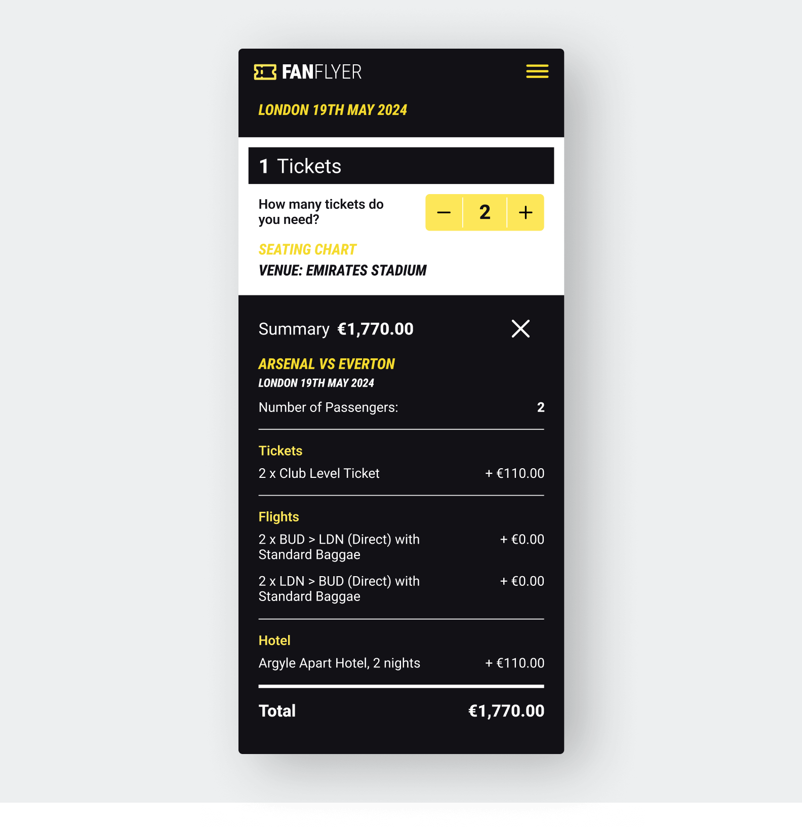
Pricing summary
The client wanted to keep the pricing of individual components (tickets, flights, hotels) hidden for business model reasons, while still making the overall checkout experience feel transparent and trustworthy. This required delicate UX decisions to build confidence without exposing granular costs.
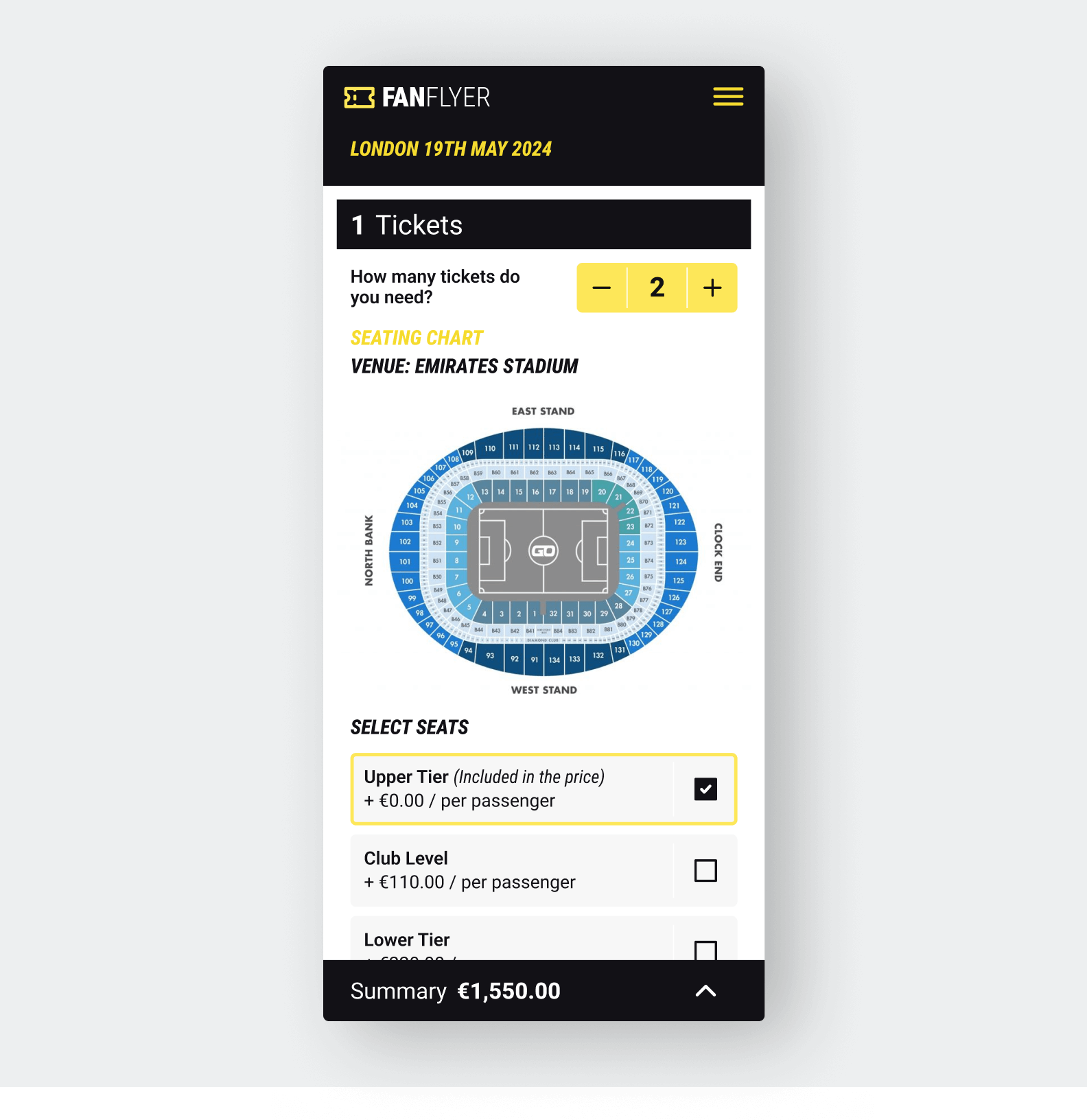
The platform relied on third-party APIs for flight and accommodation data that came with certain limitations, particularly in terms of discovery. My initial proposals, designed to let users explore and compare options using multiple criteria, had to be adapted to the technical constraints, while still providing the users with a curated experience with multiple choices.
The checkout experience needed to support a wide range of user choices like ticket types, flight options, hotel preferences, and additional extras, all spread across several steps. This level of customization introduced challenges common to e-commerce platforms: maintaining clarity, minimizing friction, and helping users feel in control throughout a potentially complex journey.
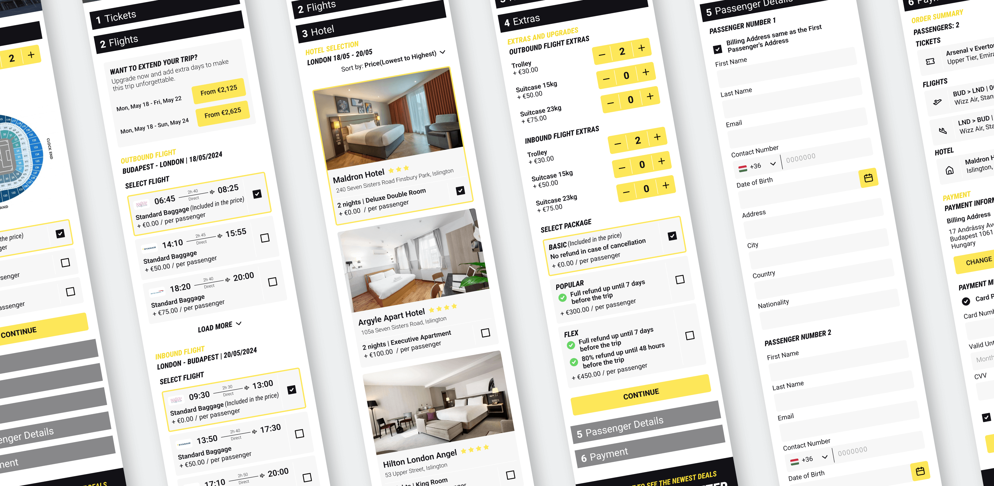
Segments of the checkout flow
Here’s how I approached each of the main challenges, aiming to keep the experience clear and structured, and to help users move through the checkout process with confidence:
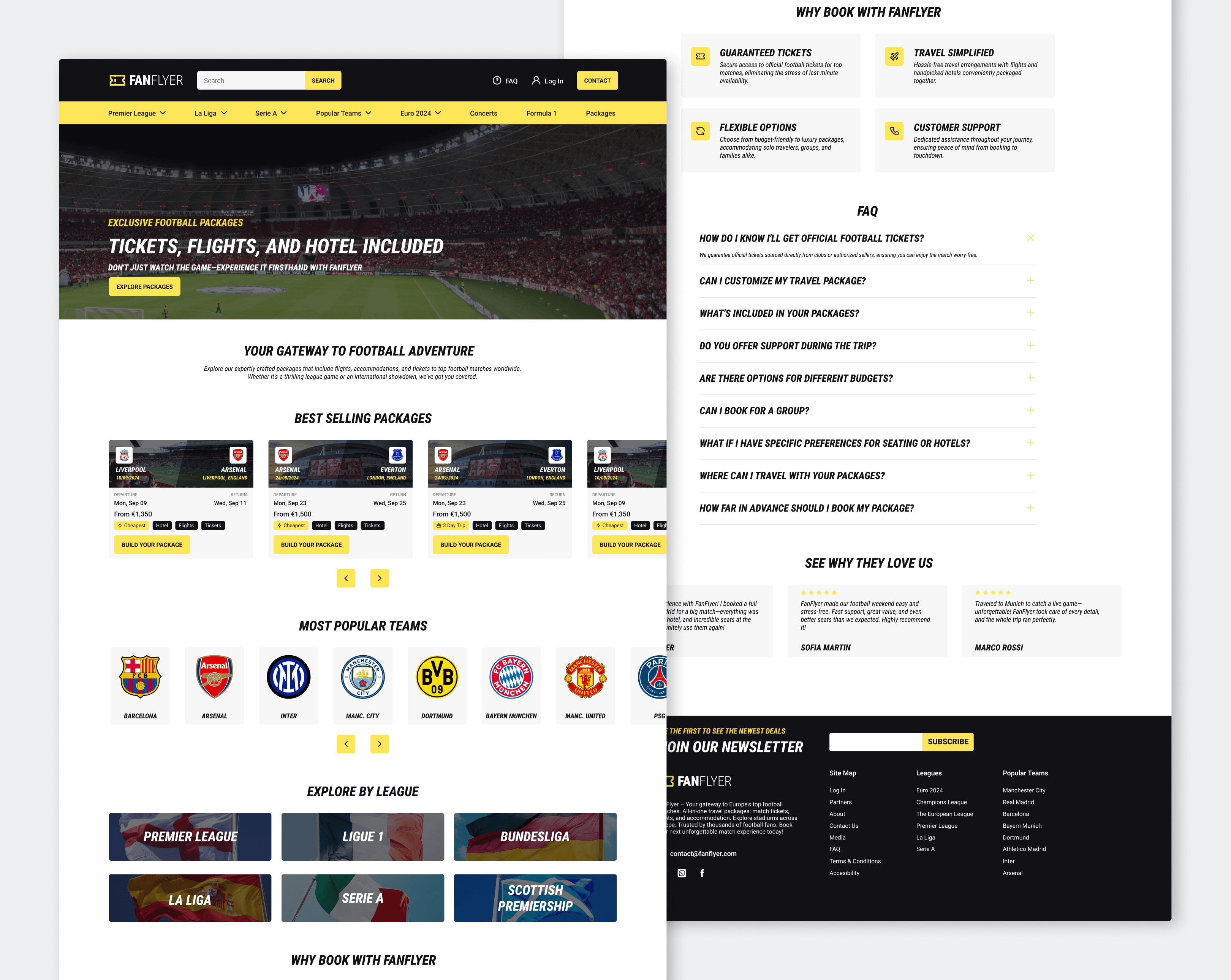
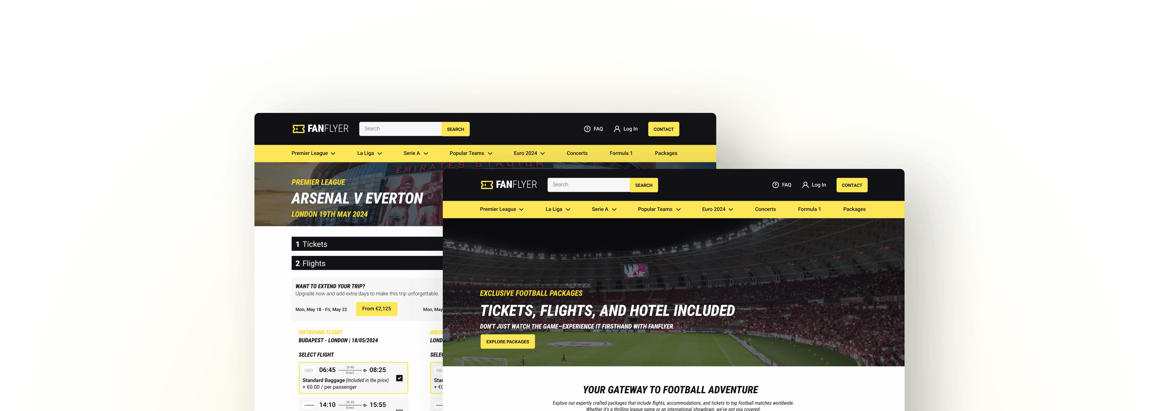
Desktop view of the homepage
Next case study